An interesting shift of Covid-19 to younger populations.
https://reason.com/2020/06/24/as-covid- ... g-younger/
the rum soaked fist: internal martial arts forum
dedicated to the discussion of the chinese internal martial arts of xingyiquan, baguazhang, taijiquan, related arts, and anything else best discussed over a bottle of rum
new thread on covid-19 updates in your location
Re: new thread on covid-19 updates in your location
![]() by Peacedog on Thu Jun 25, 2020 5:48 am
by Peacedog on Thu Jun 25, 2020 5:48 am
- Peacedog
- Great Old One
- Posts: 2195
- Joined: Fri May 23, 2008 5:22 am
- Location: Standing right next to your girl....
Re: new thread on covid-19 updates in your location
![]() by windwalker on Thu Jun 25, 2020 12:48 pm
by windwalker on Thu Jun 25, 2020 12:48 pm
Peacedog wrote:An interesting shift of Covid-19 to younger populations.
https://reason.com/2020/06/24/as-covid- ... g-younger/
Touches on some of the findings for younger populations
offers another perspective on lock downs
https://www.youtube.com/watch?v=kZqGSnVt8c8
- windwalker
- Wuji
- Posts: 10606
- Joined: Sun Mar 25, 2012 4:08 am
Re: new thread on covid-19 updates in your location
![]() by Ian C. Kuzushi on Thu Jun 25, 2020 1:29 pm
by Ian C. Kuzushi on Thu Jun 25, 2020 1:29 pm
It's an argument.
But, its premise is only valid because we refuse to join the rest of the modern world in providing our citizens with healthcare and financial support through the crisis.
In other words, it's a false dilemma and you are buying it hook, line, and sinker.
But, its premise is only valid because we refuse to join the rest of the modern world in providing our citizens with healthcare and financial support through the crisis.
In other words, it's a false dilemma and you are buying it hook, line, and sinker.
文武両道。
Lord Li requires one hundred gold coins per day!
Lord Li requires one hundred gold coins per day!
-

Ian C. Kuzushi - Great Old One
- Posts: 2610
- Joined: Sun May 15, 2011 10:02 pm
Re: new thread on covid-19 updates in your location
![]() by LaoDan on Thu Jun 25, 2020 1:52 pm
by LaoDan on Thu Jun 25, 2020 1:52 pm
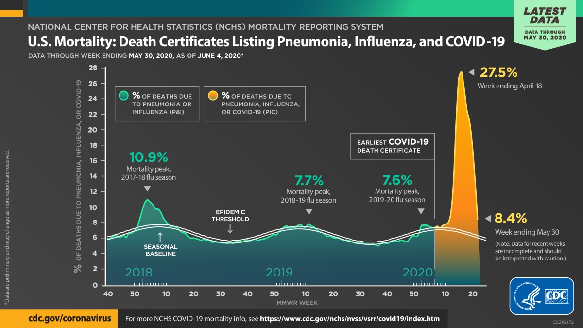
Graph using actual US CDC data:
- LaoDan
- Wuji
- Posts: 624
- Joined: Mon May 17, 2010 11:51 am
Re: new thread on covid-19 updates in your location
![]() by everything on Thu Jun 25, 2020 2:27 pm
by everything on Thu Jun 25, 2020 2:27 pm
first off, this is a pretty hard to read graph (garish colors, one of the % is additive, doesn't seem to say % of what total, the last 8.4% number is probably incomplete but you have to read the fine print). kind of sad it's from supposed data experts. guess they're expert in data and not data storytelling. to get a point across, these things are super important.
the actual message seems to be that covid is deadlier than the flu. whomever is supposed to read this chart (and NEEDS to realize this fact) isn't going to be able to be swayed by this chart (due to the bad chart and probably due to being chart illiterate/illiterate/not being a reader in general).
not sure what to do about that. again... as i mentioned on the crazy thread, people just seem stupid (bad reasoning ability) as well as foolish (bad decision making ability). they/we don't listen to experts, authorities, leaders, etc. really hoping everyone proves me wrong.
a data scientist told me the two biggest factors are:
1. population density
2. mobility (how much are people moving around)
on average, we can't control for the first factor (most of us won't move from a high density area), but we can control if we're going lots of places with lots of people around.
amateur practices til gets right pro til can't get wrong
/ better approx answer to right q than exact answer to wrong q which can be made precise /
“most beautiful thing we can experience is the mysterious. Source of all true art & science
/ better approx answer to right q than exact answer to wrong q which can be made precise /
“most beautiful thing we can experience is the mysterious. Source of all true art & science
-

everything - Wuji
- Posts: 8309
- Joined: Tue May 13, 2008 7:22 pm
- Location: USA
Re: new thread on covid-19 updates in your location
![]() by Steve James on Thu Jun 25, 2020 2:48 pm
by Steve James on Thu Jun 25, 2020 2:48 pm
on average, we can't control for the first factor (most of us won't move from a high density area), but we can control if we're going lots of places with lots of people around.
I think whatever people do, the question is still the number of hospitalized --particularly those who need ICU beds. Younger people who take up beds use up resources, even when they recover. People still need cancer treatments, etc., and there can be just as many accidents.
Anyway, treatments are improving. Many countries are working on a vaccine (for next season). The first question will be distribution, and the second will be preparation for another outbreak.
Other than that, nothing has really changed. Maaaybee we're toward the middle. However, it's hot outside. The virus doesn't seem to be dying. So, it may last through the summer, at least, meaning that it's not seasonal.
"A man is rich when he has time and freewill. How he chooses to invest both will determine the return on his investment."
-

Steve James - Great Old One
- Posts: 21200
- Joined: Tue May 13, 2008 8:20 am
Re: new thread on covid-19 updates in your location
![]() by Steve James on Thu Jun 25, 2020 5:33 pm
by Steve James on Thu Jun 25, 2020 5:33 pm
The CDC now lists 11 symptoms associated with COVID-19.
These symptoms usually appear two days to two weeks after exposure to the virus, according to the CDC.
Fever or chills
Cough
Shortness of breath or difficulty breathing
Fatigue
Muscle or body aches
Headache
New loss of taste or smell
Sore throat
Congestion or runny nose
Nausea or vomiting
Diarrhea
So, those are the most common symptoms recognized. Of course, a person can have any of them and not test positive for the virus. I think that it'd be a good idea to get tested if you have any of the symptoms, and especially if they get worse. Otoh, keeping out of circulation might be smart, too. Same rules as before. If you wouldn't call 911 or rush to the emergency room for your symptoms before, probably no need to do it now. Stay home, if you can.
"A man is rich when he has time and freewill. How he chooses to invest both will determine the return on his investment."
-
Steve James - Great Old One
- Posts: 21200
- Joined: Tue May 13, 2008 8:20 am
Re: new thread on covid-19 updates in your location
![]() by Steve James on Fri Jun 26, 2020 6:19 am
by Steve James on Fri Jun 26, 2020 6:19 am
https://www.nytimes.com/interactive/202 ... NcNuR5LqFE
https://www.nytimes.com/interactive/2020/us/coronavirus-spread.html?referringSource=articleShare&fbclid=IwAR34G3ggnhHXiesyjY_d-PnbEKYebG_n1T8yLRT_iGBgEsjjtNcNuR5LqFE
https://www.nytimes.com/interactive/2020/us/coronavirus-spread.html?referringSource=articleShare&fbclid=IwAR34G3ggnhHXiesyjY_d-PnbEKYebG_n1T8yLRT_iGBgEsjjtNcNuR5LqFE
"A man is rich when he has time and freewill. How he chooses to invest both will determine the return on his investment."
-
Steve James - Great Old One
- Posts: 21200
- Joined: Tue May 13, 2008 8:20 am
Re: new thread on covid-19 updates in your location
![]() by roger hao on Fri Jun 26, 2020 8:54 am
by roger hao on Fri Jun 26, 2020 8:54 am
Those that feel they were previously infected maybe fooling themselves -
I thought the same from a bout with flu or whatever in December - especially
after getting sick in China a short time before that.
My tests as of today -
Virus - negative
Antibody - negative
I thought the same from a bout with flu or whatever in December - especially
after getting sick in China a short time before that.
My tests as of today -
Virus - negative
Antibody - negative
- roger hao
Re: new thread on covid-19 updates in your location
![]() by LaoDan on Fri Jun 26, 2020 10:15 am
by LaoDan on Fri Jun 26, 2020 10:15 am
everything wrote:first off, this is a pretty hard to read graph (garish colors, one of the % is additive, doesn't seem to say % of what total, the last 8.4% number is probably incomplete but you have to read the fine print). kind of sad it's from supposed data experts. guess they're expert in data and not data storytelling. to get a point across, these things are super important.
the actual message seems to be that covid is deadlier than the flu. whomever is supposed to read this chart (and NEEDS to realize this fact) isn't going to be able to be swayed by this chart (due to the bad chart and probably due to being chart illiterate/illiterate/not being a reader in general).
The graph shows the % of death certificates that list flu and pneumonia as the cause (or after the first reported death due to COVID-19, also includes those deaths). For the most part I like the chart (although I could do without the colors) because a lot of information can be extrapolated from it. I think that they were trying to show all viral deaths in the USA over the period shown, which includes the atypically bad flu season in the winter of 2018, and the typical seasonal fluctuations. I am not certain about the “pneumonia” part of the data since some are caused by viruses, but others are caused by bacteria or other things (but perhaps the death certificates are not that specific?). 100% would include ALL deaths in the USA for which a cause has been determined: all murders, suicides, accidents, poisonings, asphyxiations, drowning, heart attacks, strokes, natural causes, etc.
Here are some of the numerous possible takeaways:
Deaths due to viral infections are present year round; not JUST in the winters (where it increases, but they do not go to 0% in the summers).
Summers do not eliminate viruses (and the deaths caused by them) in the USA, and therefore we should not expect summer to kill the coronavirus (although it probably will reduce the number of COVID-19 cases).
Even though flu deaths may only occur in 0.1% of cases, those deaths still comprises a significant % of annual (or monthly/weekly/quarterly...) deaths.
It shows that we had a peak in May (perhaps due to NY city) that indicates that deaths after the initial outbreak have gone down [social restrictions in response to the initial outbreak were sufficient to get control of the viral spread].
Once the data for June are added to the chart, we will be able to assess whether the loosening of restrictions results in a second peak.
At its peak, one can see that deaths caused by viral infections accounted for about 27.5% of all the deaths in the USA.
Deaths from suicides (due to depression from job losses, isolation, etc.) are not more significant than deaths due to COVID-19.
It does show that COVID-19 is deadlier than the flu.
Etc.
- LaoDan
- Wuji
- Posts: 624
- Joined: Mon May 17, 2010 11:51 am
Re: new thread on covid-19 updates in your location
![]() by Ian C. Kuzushi on Fri Jun 26, 2020 10:31 am
by Ian C. Kuzushi on Fri Jun 26, 2020 10:31 am
So, I'm just coming out of a three-week long bout of respiratory illness here in Chicago. Coughing, fatigue, shortness of breath, low oxygenation. Went and got tested about two and a half weeks ago at at NWM. They lost my test. A few days later, my wife, who works in testing tents (for some reason, they had me go in, which was horrible and scary) had been exposed several times and got an antibodies test. Her test came back negative. So, we don't really know what to think. Well, I think the hospital she works for is a complete mess, and I wonder about the antibody tests.
Anyway, our overall levels in IL seem to be holding steady. But, we also have other issues like the crazy fireworks. My friend who is a postdoc here was attached by a group of late teens last night who shot him and his dog with "around 15-20 exploding firework projectiles." Right in front of his fancy apt building. He's okay, but has some minor burns and his dog is traumatized. Quarantine, civil unrest, and uncertainty has made the city a crazy place. I'm sure most of you remember at the start of all this a guy picking a fight with me in the Ace hardware store because I was wearing a mask and gloves. I guess that was just the start.
Anyway, our overall levels in IL seem to be holding steady. But, we also have other issues like the crazy fireworks. My friend who is a postdoc here was attached by a group of late teens last night who shot him and his dog with "around 15-20 exploding firework projectiles." Right in front of his fancy apt building. He's okay, but has some minor burns and his dog is traumatized. Quarantine, civil unrest, and uncertainty has made the city a crazy place. I'm sure most of you remember at the start of all this a guy picking a fight with me in the Ace hardware store because I was wearing a mask and gloves. I guess that was just the start.
文武両道。
Lord Li requires one hundred gold coins per day!
Lord Li requires one hundred gold coins per day!
-
Ian C. Kuzushi - Great Old One
- Posts: 2610
- Joined: Sun May 15, 2011 10:02 pm
Re: new thread on covid-19 updates in your location
![]() by Ian C. Kuzushi on Fri Jun 26, 2020 10:33 am
by Ian C. Kuzushi on Fri Jun 26, 2020 10:33 am
roger hao wrote:Those that feel they were previously infected maybe fooling themselves -
I thought the same from a bout with flu or whatever in December - especially
after getting sick in China a short time before that.
My tests as of today -
Virus - negative
Antibody - negative
Thanks for sharing. I wonder what other bug I could have picked up that would cause my oxygen levels to drop for weeks and last so long?
文武両道。
Lord Li requires one hundred gold coins per day!
Lord Li requires one hundred gold coins per day!
-
Ian C. Kuzushi - Great Old One
- Posts: 2610
- Joined: Sun May 15, 2011 10:02 pm
Re: new thread on covid-19 updates in your location
![]() by windwalker on Fri Jun 26, 2020 10:36 am
by windwalker on Fri Jun 26, 2020 10:36 am
Once the data for June are added to the chart, we will be able to assess whether the loosening of restrictions results in a second peak.
No mention of recent riots, are they accounted for in the "loosening of restrictions" ?
- windwalker
- Wuji
- Posts: 10606
- Joined: Sun Mar 25, 2012 4:08 am
Re: new thread on covid-19 updates in your location
![]() by Steve James on Fri Jun 26, 2020 11:15 am
by Steve James on Fri Jun 26, 2020 11:15 am
Well, NYC had two nights of looting three weeks ago. Our case numbers are still dropping. Probably because a lot were wearing masks. Most of the places that are experiencing an increase, were in denial, ignored the early warnings, or loosened their restrictions a month ago.
"A man is rich when he has time and freewill. How he chooses to invest both will determine the return on his investment."
-
Steve James - Great Old One
- Posts: 21200
- Joined: Tue May 13, 2008 8:20 am
Re: new thread on covid-19 updates in your location
![]() by everything on Fri Jun 26, 2020 11:31 am
by everything on Fri Jun 26, 2020 11:31 am
the rest of us (Southeast and Southwest states) are learning things the hard way.
amateur practices til gets right pro til can't get wrong
/ better approx answer to right q than exact answer to wrong q which can be made precise /
“most beautiful thing we can experience is the mysterious. Source of all true art & science
/ better approx answer to right q than exact answer to wrong q which can be made precise /
“most beautiful thing we can experience is the mysterious. Source of all true art & science
-
everything - Wuji
- Posts: 8309
- Joined: Tue May 13, 2008 7:22 pm
- Location: USA
Who is online
Users browsing this forum: No registered users and 55 guests